BANNER ADS
SPEC AD
Three looping frames
AUDIENCE:
Tech-savvy people aged 30-50 with household incomes of 75k+
CHALLENGE:
Entice the consumer to click the banner ad, and be taken to a landing page where they can subscribe to The New Yorker's digital-only format.
SOLUTION:
I focused on brevity and consumer benefit with copy that creates an immediate brand association. I made the audience aware that the product is more conveniently accessed, but doesn't sacrifice the quality that readers trust.
SPEC AD
Three looping frames
AUDIENCE:
Professional men and women aged 35–50, always on the go, balancing career & family, and facing stress manifested by regular headaches.
CHALLENGE:
Click banner ad, visit product page, go to an informational site to learn more about stress & purchase the product with free shipping.
SOLUTION:
I emphasized that the product is designed for busy people and is smaller/easier to open than most pill bottles. Included educational link and click-through to purchase.
EMAIL MARKETING

SPEC AD
Email for Johnson’s Baby Conditioner
AUDIENCE:
Parents of young children aged 0–2 years, looking to purchase the highest quality of products for their children.
CHALLENGE:
Increase awareness of the product and encourage people to make a purchase.
SOLUTION:
In appealing to the target audience, I provided detailed information about the product and provided a click-through coupon to an area where the consumer can make a first-time purchase at a discount.

SPEC AD
Email for Macy's Men's Fall Sweater Event
AUDIENCE:
Men aged 28–45 and those who shop for this demographic. They like having a stylish wardrobe, and events like this help them stay fashionable at a good price.
CHALLENGE:
Get shoppers to visit their local Macy's department store during the event and purchase the product.
SOLUTION:
I mentioned the discount in the snippet and header, and repeated the date of the event and the discount several times. I made sure to list the benefit to the consumer in all copy areas and included a click-through location finder.

-0001.png/:/cr=t:0%25,l:0%25,w:100%25,h:100%25/rs=w:370,cg:true)
.png/:/cr=t:0%25,l:0%25,w:100%25,h:100%25/rs=w:370,cg:true)
SPEC AD
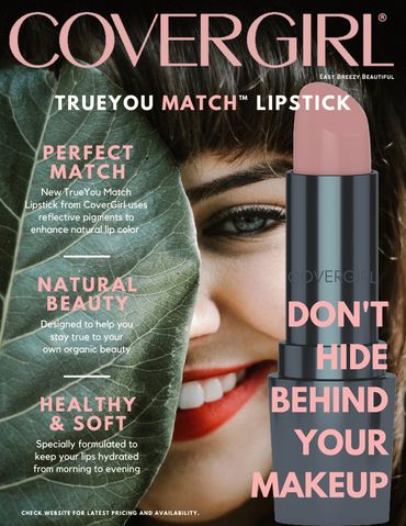
Magazine Ad for COVERGIRL TrueYou Match Lipstick
3 alternate versions of heading to appeal to different types of consumer
AUDIENCE:
Women aged 25–45 who purchase cosmetics and healthy/organic products. They don't want to feel "made up," but enjoy looking their best. They have the confidence to go without makeup and prefer using products that look natural once applied.
CHALLENGE:
The ad should capture the attention of those who buy healthy, environmentally friendly items, and prefer natural-looking cosmetics.
SOLUTION:
I wanted the target audience to know that this product isn't like any other, because of a revolutionized formula that enhances natural lip color. It isn't heavy like other makeup, and keeps lips soft and healthy. I designated three subheaders with details under each, for an easy-to-digest breakdown of these true benefits. I used the main heading to boldly illustrate that this lipstick isn't designed to cover up or "color" lips, but rather to enhance the wearer's natural qualities.
WEBSITE LANDING PAGE

SPEC AD
Landing Page for University Contest Entry
AUDIENCE:
College students aged 18–22
CHALLENGE:
Collect names, email addresses, and phone numbers from contest entrants, and encourage them to share the ad with their friends to win a supply of Cheetos to last through college.
SOLUTION:
It was important to connect with the target audience, so I addressed them in a bold and friendly (on-brand) style. I made sure that the entry-form copy was clear and easy to navigate. I also created opportunities for sharing the information with friends, and for posting the contest on social media.
PORTFOLIO PROJECT PAGES


Graphic Designer Portfolio Site
Project Pages
AUDIENCE:
Hiring managers, seekers of design projects for freelance work, artists, and designers
CHALLENGE:
Write project descriptions for theoretical and existing designs, underscoring the approach of architectural elements.
SOLUTION:
I listened to the designer describe the thoughts behind each project, and found a balance of technical and artistic language to voice each concept.
DIRECT MAIL

SPEC AD
Side 1 of 2-sided, full-color direct mail postcard
AUDIENCE:
People aged 22-30 who want quality cookware at an affordable price
CHALLENGE:
Create awareness of new product line, and drive sales. Intrigue people to visit the online store to learn more, and ultimately purchase the product. (Design note: Include an area for printing of the recipient's closest store location.)
SOLUTION:
I chose to promote this new product line with the discount promo featured on both sides of the postcard & reiterated the affordability of the product. I also included a list of items that would be available to view by visiting the website.

SPEC AD
Side 2 of 2-sided, full-color direct mail postcard
I included the discount promo code in a prominent location for a call-to-action item. I promoted the discount, promo code, and landing page URL on both sides, and listed the benefits of visiting the website.
Copyright © 2021 The Write Paw - All Rights Reserved.